 Ballistic Media
Giving a German-engineered bathroom brand an identity as precise as its product.
- Client
- Sternhagen
- Sector
- Home & Interiors
- Scope
- Brand IdentityBrand GuidelinesWebsite Design & Development
Key result
A complete brand identity, from monogram to newsletter, documented in a single 45-page brand book.
Overview
Project Overview
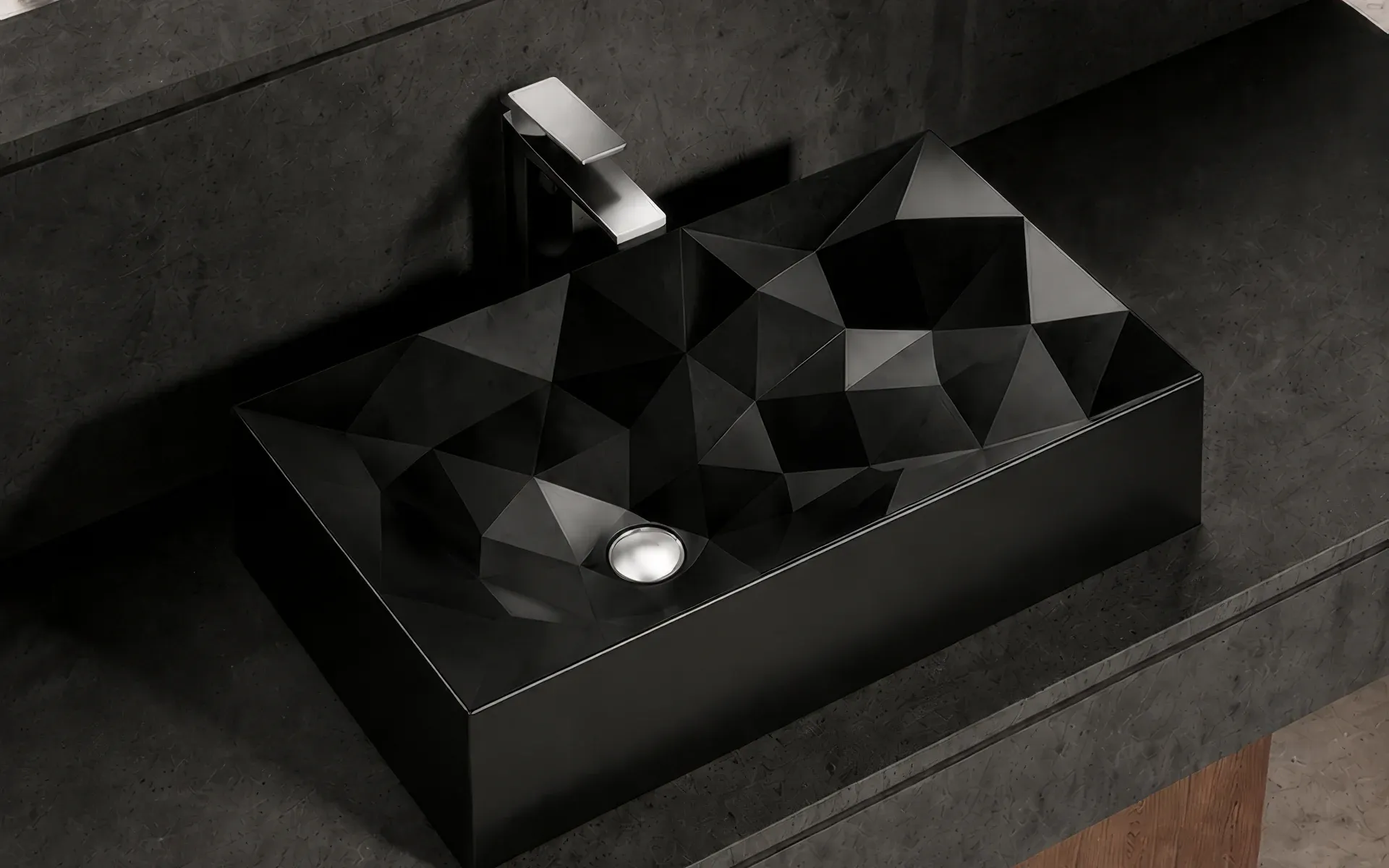
Sternhagen is a German-engineered luxury sanitaryware brand, established in 2011 and working across Germany and India, with a range that runs from basins and faucets to bathtubs, showers and tiles. Ballistic built its brand identity, from the SH monogram and colour palette to voice, stationery, packaging and digital, and set it all down in a brand book. We also designed and built its website around the 2026 collection.
Showcase
09 images
The work
How we approached Sternhagen, and what we built.
The Starting Point
Sternhagen makes German-engineered luxury sanitaryware, from basins and faucets to bathtubs, showers and tiles. Its idea of luxury is a quiet one: it begins with simplicity, and every product reflects clean lines, refined craftsmanship and lasting quality.
That idea had to be drawn, written down and applied the same way everywhere: on the product, in the showroom and in the inbox. We built Sternhagen a brand identity and a brand book to hold it together, and designed and built its website around the 2026 collection.
Our Approach
We started from the brand's own words. Art meets engineering became the organising idea: form is drawn, sculpted and refined, and beauty is held to tolerance. Four fixed points sit behind every decision:
- Precision – every tolerance accounted for, nothing approximate, nothing left to chance
- Restraint – luxury spoken quietly; we remove until only the essential remains
- Craft – the hand behind the machine, with materials chosen and finished with intent
- Permanence – objects made to outlast trend, timeless rather than of-the-moment
What We Did
1. Brand Foundation & Positioning
The brand book opens with the story, the philosophy and the material at the centre of the range: Sani-Quartz, a patented engineered quartz composite with a silk-matte finish. We set the brand promise, sanitaryware conceived as art, resolved as engineering, for those who notice the difference, and built it on three ideas: the object, the material and the ritual.
We also defined who the brand is for: affluent homeowners aged 35 to 60 who are building or renovating a premium residence, who value quality over logos and notice detail others miss. Two more people are in the room, the specifier (an architect or interior designer) and the upgrader renovating a single signature bathroom, and the book marks the points in the purchase journey where the brand has to show up.
2. A Mark Built From the Bathroom
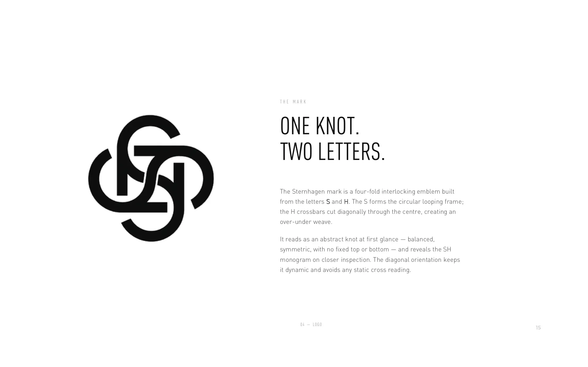
The Sternhagen mark is a four-fold interlocking emblem built from the letters S and H. The S forms the looping frame and the H crossbars cut diagonally through the centre in an over-under weave. At first glance it reads as an abstract knot; on a closer look it reveals the SH monogram.
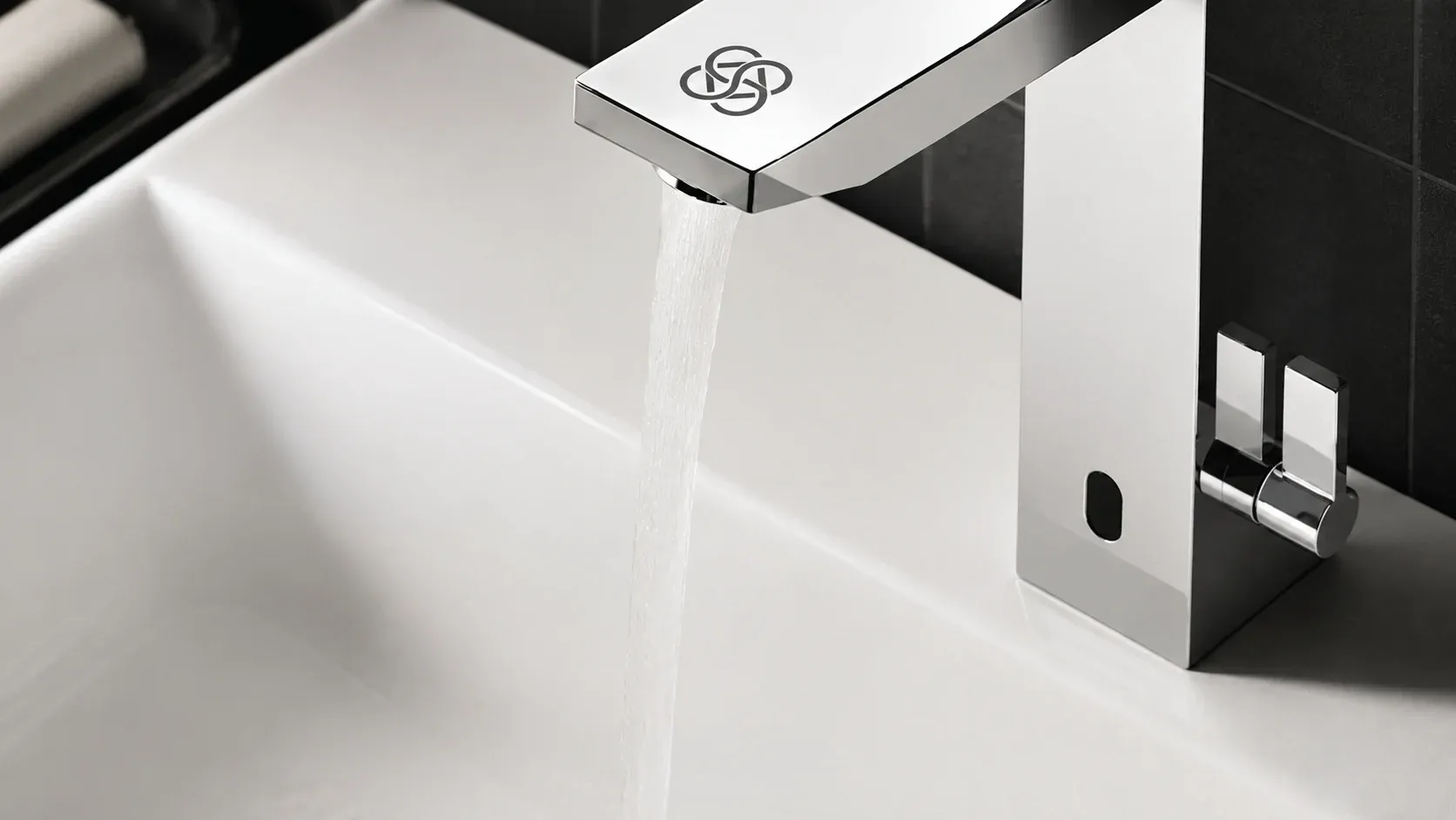
Its starting points come from the bathroom itself: the sink, the tap and the flow of water, distilled into a single mark. The geometry is exact, four equal circles set on a 45-degree diamond, which is why the guidelines require the mark to be reproduced from master artwork and never redrawn by hand.
3. A Logo System With Rules
Clear space around the mark, a minimum size and three approved colourways: black on light, white on dark and a muted grey for watermarks. Six things are ruled out: rotating, stretching, recolouring, adding effects, outlining or crowding the mark. Over photography, the white mark sits in calm negative space.
4. Colour & Typography
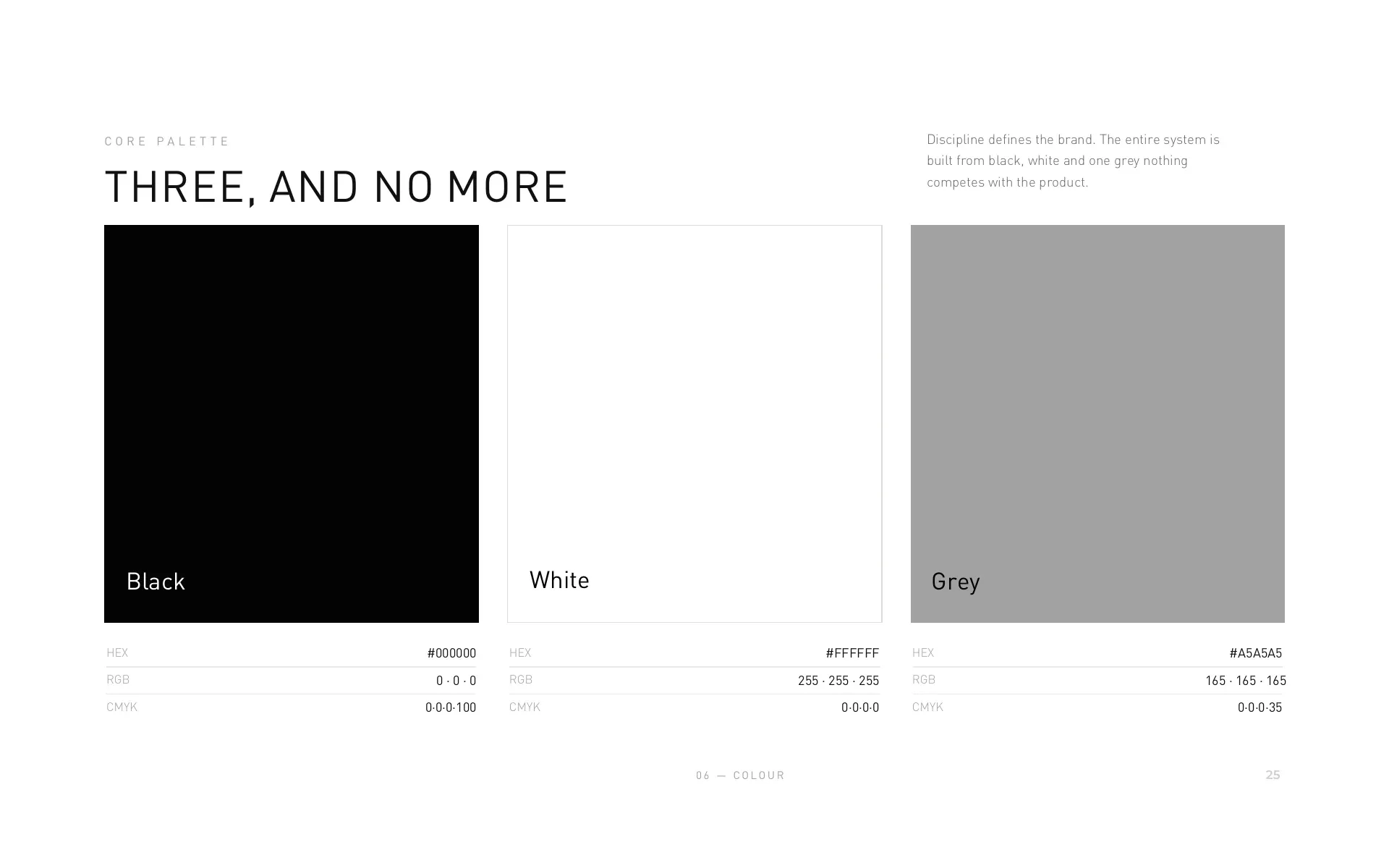
A disciplined monochrome system: black, white and one precise grey (#A5A5A5), plus a greyscale used for hierarchy and never as a brand colour in its own right. The palette follows a ratio of 70% white, 24% black and 6% grey, and the approved text and background pairings meet WCAG AA. Typography relies on proportion, spacing and restraint, so hierarchy comes from scale instead of heavy weights.
5. Voice & Tone
We wrote the voice the way the brand is designed, with restraint: deliberate, precise and quiet. "A basin sculpted from a single block. Engineered to a tolerance you can feel." is the register, and the hard sell is out.
6. The Identity in Use
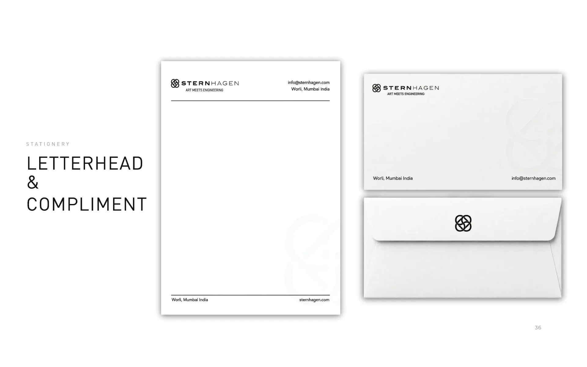
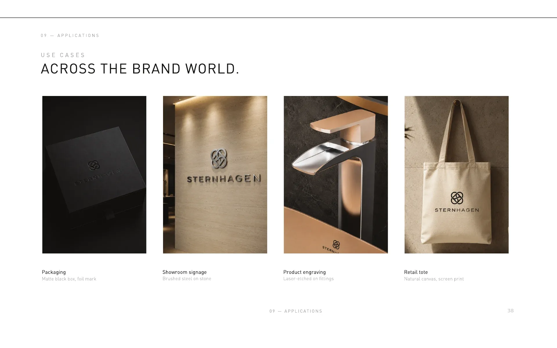
The book shows the system applied to stationery, with business cards (85 × 55 mm), letterhead, compliment slips and an email signature, and across the wider brand world: matte black packaging with a foil mark, brushed-steel showroom signage, laser-etched engraving on fittings and a canvas retail tote. Everything sits on a 12-column layout grid.
7. Digital: Newsletter & Social
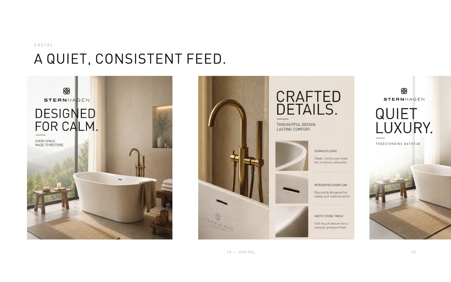
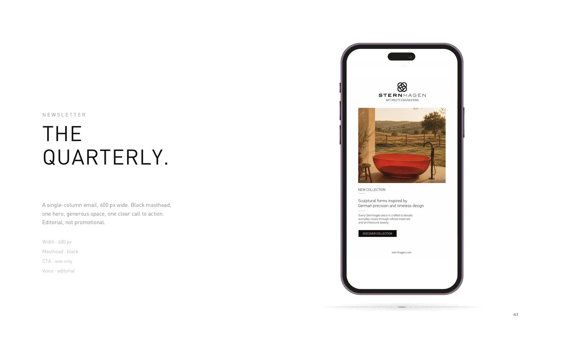
For the inbox, a quarterly newsletter: a single column 600 px wide with a black masthead, one hero and one clear call to action, editorial rather than promotional. For social, a quiet, consistent feed that lets the product and the space lead.
8. Governance
The book closes with a one-page checklist. Always: reproduce the mark from master artwork, preserve clear space, hold to black, white and the single grey, let whitespace and the product lead, and write with restraint. Never: redraw, rotate, stretch or recolour the mark, introduce a second typeface or accent colour, crowd the logo below its minimums, add shadows, gradients or effects, place the mark over busy imagery, or over-promise in copy.
9. The Website
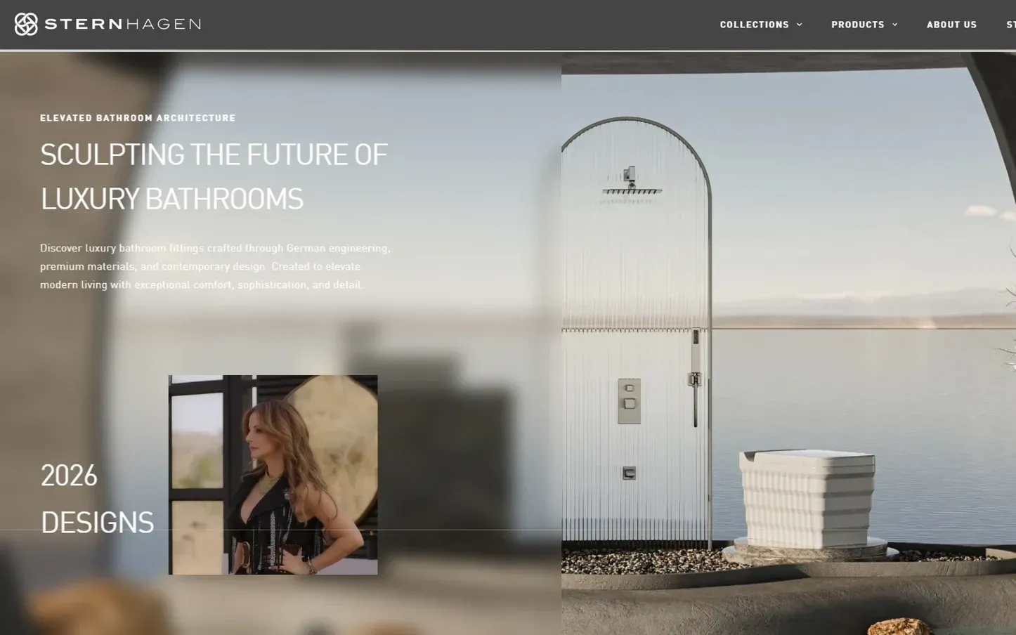
Alongside the identity, we designed and built Sternhagen's website around its 2026 collection, pairing large-format product photography with a calmer, gallery-like layout to match the precision of the product line itself.
The Outcome
Sternhagen now has an identity that works as a system: a monogram with a story, a three-colour palette, a defined voice and clear rules for how the brand appears on product, in print, in the showroom and online. All of it is documented in a single 45-page brand book, so any team or partner can apply it the same way.
Your next growth phase
Let's make your marketing work together.
If your brand, website and marketing need a clearer direction, let's start with a conversation about where your business is today and where you want to go.
We'll discuss your priorities and explore what kind of support makes sense.
4.9on Clutch · 80+ reviews